My first time with Claude
Implementing my first feature with the helping hand of AI
How often do we get to document the very first time we do something?
On the first meeting of the Friends Of Figma community I was asked when was the first time I used Figma. Considering how much of my life I spend on Figma, it would be amazing if I could draw my story with the tool that precisely but, obviously, I can't.
Recently, though, a very important player has entered the field of technology and this is the entire documentation of the first night I spent with it.
Why
Definitely did not do this to find out if Claude can code. You will see in a couple of paragraphs that the task is pretty simple and it's March 2026, you don't need to step out of any of your feeds to see someone building a rocket with Claude as an assistant.
Definitely did not do this to find out if Claude can design. It can't. For now.
Did this to find out how Claude Code can help me. I, who have no interest in building a company, or launching 3 apps within the next week but am pretty optimistic that AI can help me not have to juggle 230 layers of text on Figma and instead focus on grander design decisions.
What I wanted
The task I decided to tackle for the first session was pretty simple: implement a blogging section to my portfolio. Oh yeah, the one you are reading right now, this is so meta.
This is nothing advanced in the world of front-end development, matter of fact, I have in the past implemented this by hand on this very website. This is also nothing fancy from the design point of view, although there are fairly nice design decisions to be made.
Despite not being sexy for either the designer or the developer involved in this, the feature is important, so I understand this as a good task to double down on speed, hitting the important points and freeing the team to spend more time on sexier and even more important problems.
And I am extrapolating the context of my personal website with this analysis because I know all of these for a fact since I have already worked on something like this at work too. Which is my ultimate reason to choose this task to start.
I have done this before
Midway through my time at Stone my team decided we had had enough with the workflow for using the News app. This app allowed the CRM and Marketing team to publish small announcements right into the credit card machine so that our clients and their employees could be updated on promotional conditions or new technologies.
The problem with this app is that every time someone wanted to publish we had to stop a designer and a developer to lay out the text from CRM, make sure all the images and other resources would work on tiny screens and then code it by hand. If you are quick on your feet you must be thinking: what if you had a template so that the message would always work? Yes, that's what we built!

If I was trying to benchmark Claude's powers, building and launching an app on the App Store with five prompts would be awesome - and make for a very flashy headline. But since I am trying to improve my own workflow with the help of Claude, comparing it with a task I have familiarity with (and remarks about) is way more efficient.
What we did
Step 0: Signing up for Claude
A couple of days prior to my first session, I signed up for a Claude Pro subscription. It is a little confusing to understand which plan you should get because Claude doesn't really tell you the limits of each one.
Truth is, we don't really understand the token economy of any AI tool yet, which makes it hard to price - and consequently to buy - AI. I bet I will only gain more insight on this when I hit a wall with my current plan.
Step 1: Setting Claude up
Running Claude Code in the terminal was a fun ride. I had an issue with an environment variable and it took me 5 minutes to figure it out. I vaguely know what environment variables are because I have set up a fair share of terminal tools in the past, but I wonder what other non-coders with way less understanding will do when they see the message in the terminal. Probably, open the non-terminal Claude and ask it for help.
Greeting Skills
I won't try to teach you what skills are because I haven't studied enough on the topic to discuss it at length. Although it is a blessing that even without knowing a lot about the topic, one is still able to use and abuse it, I will still take the time to understand them before writing on the topic.
For the extent of this article all you need to know is that I installed Superpowers, the only Skill I had been recommended directly, straight away. A teaser of its features is "it starts from the moment you fire up your coding agent. As soon as it sees that you're building something, it doesn't just jump into trying to write code. Instead, it steps back and asks you what you're really trying to do".
Step 2: Understanding the task at hand
Thankfully, my first step is also understanding the task at hand. Knowing that I wanted a blog on my website is not a task per se, is simply a wish and there are a lot of moving parts to consider, for example:
- What is the best way for me to write blog posts and how can this workflow work with it?
- What reading experience do I want to provide? Reading time matters? I have some ideas for very long posts, how to handle that?
- Will I write in more than one language?
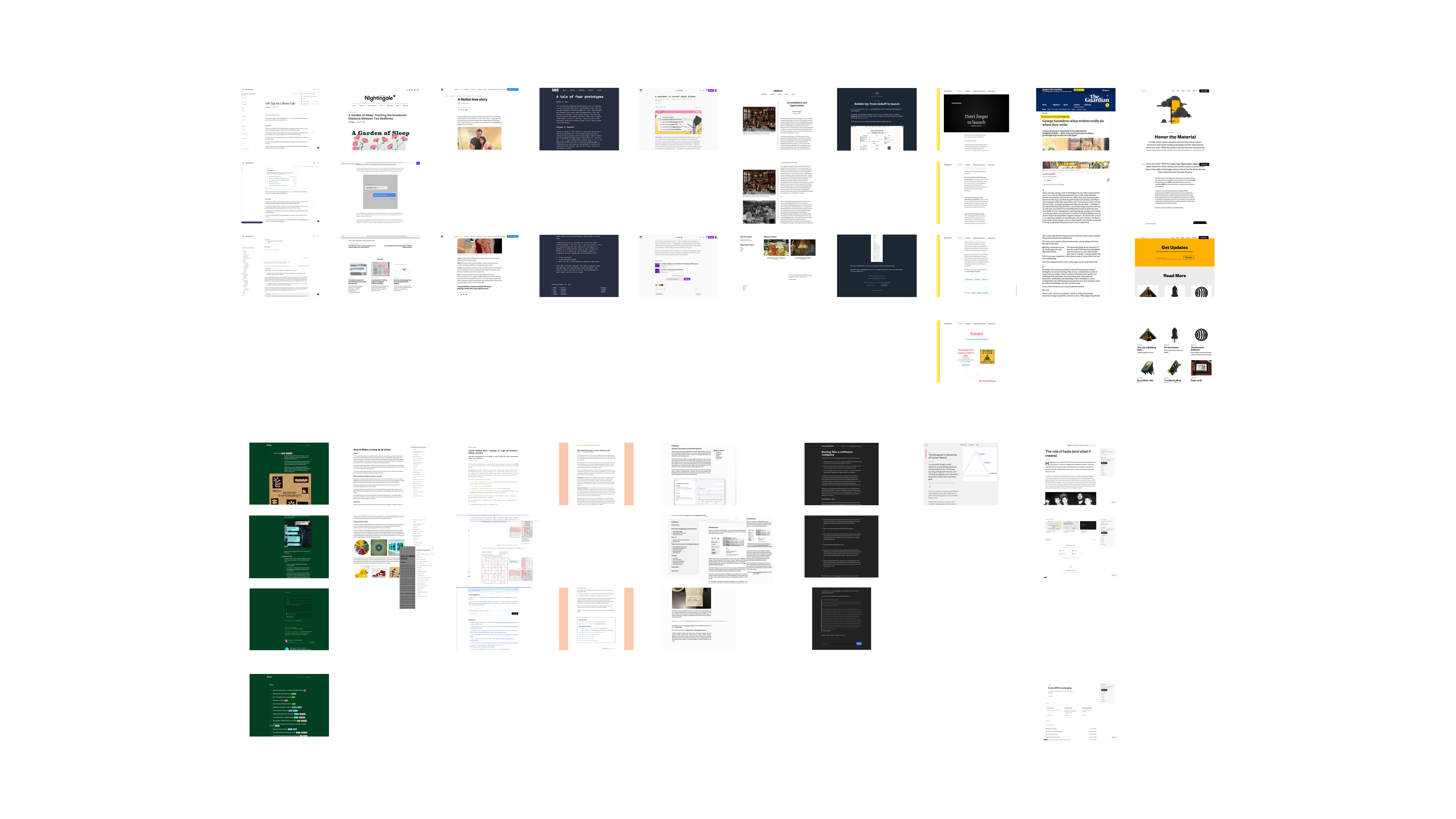
To assemble my state of the art blog, I started diving into my favorite blog posts1. I got all of them on a Figma file (you thought I wouldn't touch Figma anymore, huh?) just to be able to make comparisons, understand layout and features.
I imagine I could have given Claude a list of the posts and asked him to give me a summary of their layout and features, but if we know that he is not good at designing why would we delegate design inference to him? This is like looking at your employees and assigning each of them tasks specific to the things they are worst at.
That said, I now imagine it is already possible to ask Claude to pair with Figma and given a list of links, have them assemble a benchmark file for me to comment and reflect on, taking the mechanical work out of my hands. I will try this in our next session together.
Step 3: Pitching Claude the task
It took me ~20 minutes of musing to turn all the ideas stemming from the little benchmark into a prompt. All of these 20 minutes were spent writing and none of it was spent drawing any sort of solution on Figma or any other tool.
When I was satisfied enough with the text, I woke Claude up and kickstarted our session:
Hey, Claude! Ready to work?
Today we are going to implement a Blog section on my website. I'm gonna need you to write a small blog post with three sections and some images so we can test out the layout, by the way. I have written some specifications for the post structure, the navigation and the blog page itself so we can start hitting it on.
For every element styling please make sure to take a look around what we already have and use the same aesthetic.
Post structure
- All posts are markdown (.mdx) files
- The markdown file of a post should contain the following metadata:
- The date of writing in the YYYY/MM/DD format
- The title of the post as text
- A tagline of the post as text
- The language of the post as text
- A list of tags separated by comma
- A boolean to note if it is a long post or not
Navigation
- The blog page should be titled "Writings"
- We need to add a button to the general navbar, before the Now button, that leads to the blog section
Blog main page
- List the posts by most recent and group them in years of launch
Post page
- The header of the article should contain the title of the post in big letters, with the tagline of the post below it. It should also contain a "Published on" + the date of writing + "by Dandara".
- If the post is a long one, we should have a table of contents that slides on the right side of the website and keeps the user updated on which section they are on. On small screens, this can be a collapsible drawer.
- Use Tailwind Typography to stylize the markdown content and borrow styling from the Now page of this same project.
- The links in the markdown should be # ffcc00 and underlined
- The selection of text should be an opaque version of the # ffcc00 yellow
- When a link has been clicked it should be permanently brown
- Images should be centered and have a subtle shadow around them to create depth from the body of the page
- At the footer of every post page instead of showing my footer with contact information, it should have a "read next" section that lists up to the three posts that share the same tags as the post the user is currently reading
- There has to be a button above the header of the article with "Back to writings"
I pasted this onto the terminal and let Claude have at it.
Notes about "prompting"
I had a lot of time before doing this to watch people make mistakes and then learn from them. One thing people took a long time to realize is that giving Claude a spec instead of "one-shotting" something and then tweaking it endlessly is way more efficient. In retrospect, this seems obvious, after all, that's also true for me and you.
One consideration I have, though, is that the interface of the terminal doesn't really favor this, does it? Once I pasted the long text into the terminal interface, Claude collapsed all of it and just confirmed he had received the text.
This reminded me of a design debate people have had with the Slack interface. Internally, the Slack team favors long-text communication in opposition to short bursts of text. But every other company in the world that uses Slack works in the opposite way, because that input box is really small, it begs you to be quick.
Maybe the Claude team will want to learn a thing or two from Brian Lovin and Ryan Nystrom's efforts to subvert this in the Campsite interface. Or maybe not, because writing short bursts of text may be less efficient... therefore spending more tokens... and end up making Claude more money?
Step 4: Vibing with my bro Claude
After receiving my input Claude used its Superpowers to ask me a couple of follow-up questions. He offered me a few workflow options including one in which he opens a lot of different tabs with solutions so that I can put them side by side and compare. This, obviously, uses way more tokens and since I was pretty sure he would screw up the design anyway, I told him to "just make it work" and hit me up later.
Then I played one song on my guitar.
And a second.
And a third. And he was done.
12 minutes of work in case songs aren't your time metric of choice.
Here's his first output:
Isn't that good? Of course it is good. Again, this is not what we are here to attest. If you think this is impressive, you won't believe what other people are building with it.
Things I learned from this very first shot:
- Claude is proactive. If you give him freedom he will find a workaround to any gap in your prompt. That's why it is important to know what you want. I should have, for example, specified to him a topic for the blog post because once I didn't, he delved into my portfolio and wrote a blog post in my voice about my past work experience. I did not like that, it was very spooky (and wrong).
- Claude doesn't have eyes. Once again, fine-tuning design choices is really hard when you can't see the way humans see. The shadows I asked for in the images were terrible and most of the corrections I had to ask for after this shot were contrast issues.
Things I didn't learn from this very first shot:
- What Claude was really doing. I knew how he had broken the tasks down and he kept me aware of what was ongoing and what was done, but the terminal was closed through all this and even now as I write this, I don't know what he did. But being honest, a designer never knows what the developer is doing either, so as far as we're concerned in this post, there's no problem with that.
- The Token Economy. Tokens were being consumed and the numbers were updated constantly with an arrow next to it. What does that mean? How much does that help the user to know how many tokens are being spent if I was never told how many tokens I had to begin with? Is showing me how many tokens he is spending a way to create the impression of hard work being done?
Other 20 minutes were spent going back and forth with him on tweaks. All of these minutes were a blast.
I proceeded with the terminal closed, refusing to open the CSS file to fix things myself and Claude was very smart understanding exactly what I meant when I said "make this look like that element on page x".
In the midst of checking his work I caught myself saying "I don't even remember if I told him to do that" because in the span of 10 minutes a human can forget what it took them 20 minutes to write. I don't have Superpowers after all. Good thing I had my pitch saved to refer back to.
When looking at the prompt I had sent I did realize a couple of holes and things that backfired from Claude's interpretations of my words. These are all things that happen at work too, handoff is never perfect, but the back and forth with Claude is awfully faster than the systems we have traditionally set up for people to work.
How I felt
So how did Claude feel in comparison to the traditional way this task would have gone in the companies I have worked for so far?
Matched
Taking words straight from my favorite book on project management, Shape Up2:
First, we need to have the right people—or nobody—in the room. Either we're working alone or with a trusted partner who can keep pace with us. Someone we can speak with in shorthand, who has the same background knowledge, and who we can be frank with as we jump between ideas.
This quote is talking about what is necessary to shape a solution, what kind of people you need in the room with you. And if you are fortunate like me, you have been in this room. There has been that one or maybe two meetings in which all your favorite collaborators were able to attend and every phrase started with "yes, and". It felt like you could rebuild the entire company with your bare hands.
But more often than not, that's not the reality. It's way harder than it seems to find people with leveled but complementary knowledge to yours, and then also have a fruitful environment in which being frank doesn't hurt the politics of work. Having an AI as a partner in a task feels like the dream team every time.
We should meet Claude where it's at
Claude Code is awesome. But let's not focus on the fact that it is Claude and forget that it is Code. We should be complemented by it but also leveled with the medium somehow. I won't do a deep dive on my view on "designers should code" now, that's not the moment, but I will say that a designer who understands how the web (or whatever platform rocks your boat) works is going way further with Claude than one who doesn't.
I see a couple of ways this can become a reality:
- Companies should start literacy programs for designers now. Notice how I didn't say learning, I don't think you should be assigning your designers yet another skill to learn proficiently, after all, a lot seem to think not even developers should code anymore. But companies should have their designers aware of the pipeline from code to release, the languages and platforms they are working with and more.
- Claude and other AI platforms should make better use of the profile of who's using them. It's time we accept that having code in the name no longer means something is going to be used only by developers and having different levels of "helping hands" for each type of user is now a usability matter.
I will refrain from addressing other IC designers on whether they should sign up for Claude Code as soon as they leave this article or not, because I am more concerned with healthy ways for the industry to adapt and telling people to study more on their free time is not it.
Ready for more
After my back and forth with Claude to fix things I spotted, I even deployed the solution to a side branch so I could test it on the Vercel app on my phone. Everything was working perfectly on the mobile version as well - of course it was - and I now had a problem: I was very eager to keep working. Instead of being relieved that the work was done I was kind of sad I had chosen such a small and simple task, I wanted more time with Claude.
And this has been a huge problem for people working with AI.
Recently someone came to the conclusion that "prompting" is addicting because it is basically like hitting a jackpot. The session I described here can be seen as satisfying because it was a very simple problem and Claude got things fairly right, but the problem is that if the problem was harder and it got more things wrong it would be more satisfying when it finally worked.
When you hit a wall with Claude, you are forced to reframe your thinking and tweak things a bit. You maybe rephrase your prompt or even give him a screenshot to make it easier to understand what you want. Then you roll the dice again by putting him to work. Maybe you max out on your tokens before you get to the version you really wanted. So you buy more tokens. And you bet on him again. And he delivers. And now your computer is Las Vegas.
I was so close to entering the casino that my last prompt to Claude was actually asking him what else we could do with this blogging feature. And he delivered.
Content & discovery
- Tags filtering on the Writings index — click a tag to filter posts by it
- Reading time estimate on the post listing and/or header ("~5 min read")
Reading experience
- Progress bar at the top of the page that fills as you scroll through a post
- Copy link to section — a subtle # anchor that appears on heading hover
- Footnotes / sidenotes — for the kind of writing that benefits from asides without breaking flow
Navigation & flow
- Previous / next post arrows at the footer alongside "Read next", for linear reading
- "Back to top" button that fades in after scrolling past a certain point
Nice-to-haves
- Open Graph image per post (auto-generated from title + tagline) so shared links look good on social
- RSS feed at /writings/feed.xml — classic, still loved by readers who use feed readers
My personal pick would be the reading progress bar — it's low effort, high satisfaction, and fits the aesthetic you already have nicely with --dandara yellow. What catches your eye?
Thankfully what caught my eye on this response is that most of these things were crossed out on Step 2 while I tried to understand what reading experience I wanted to offer in my Blog. I did not need these things and it's not because I could, that I should have them.
Needless to say, that's not how all businesses work.
Next steps for me and Claude
It is with happiness and enthusiasm that I announce that the partnership between me and Claude will keep going. I will try to come up with more problems akin to "business problems" that I can solve with him on personal projects of mine, or even better, personal projects of others because now designers will have a tool to enter any codebase.
These problems will certainly evolve in complexity and likely even size. I have a thesis that some thinking will have to be done up front to figure out what problems should be solved by one person hitting it off with Claude and which problems still require the more traditional approach we have used thus far - if any.
All of this will be documented on this very blog, designed by me and implemented by Claude.
Footnotes
-
A list of the blog posts in the picture for the curious ones: 100 Tips for a Better Life, A Garden of Sleep: Tracking the Emotional Distance Between Two Bedtimes, A Notion love story, A tale of four prototypes, a youtuber is normal about planes, Accumulation and Appreciation, Bubble Up: From kickoff to launch, Don't forget to launch, George Saunders: what writers really do when they write, Honor the Material, How I Build, How to Make a Living as an Artist, Inside NVIDIA GPUs: Anatomy of high performance matmul kernels, My productivity app is a never-ending .txt file, Potluck: Dynamic documents as personal software, Seeing like a software company, The Designer's Hierarchy of Career Needs, The role of taste (and what it means). ↩
-
I promise to talk more about how I use Shape Up in the future because I predict it will continue being the most effective way of working regardless of AI. ↩